Blue Dot Communities
Published at Aug 7, 2026
Edit 1 Sep 2026: Map styling updated to better reflect Yes/No vote percentages. Explanatory table added to methodology section regarding different vote types.
Back in 2023, I mapped the results of Australia’s Indigenous Voice to Parliament referendum. The map showed the results by polling place, while also indicating the percentage of the population who identified as Aboriginal or Torres Strait Islander.
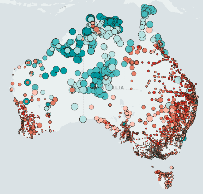
Originally I created the map out of personal interest. With Australia as a whole voting NO, I was curious about how individual communities voted, particularly the difference between urban/rural regions, and communities with a large indigenous population.
At first, I only showed the map to a few friends. But after waiting a while and not seeing any similar maps or analysis posted elsewhere, I figured others might be interested in the image. I was away from home visiting family, so hastily threw together a quick post and put it up on LinkedIn.
The post spread rapidly and was viewed hundreds of thousands of times. There were a few people with an axe to grind in the comments section, who seemed to take exception to suggesting that there was any support for the referendum. But overall, most of the feedback was encouraging, with people glad there was something out there which helped show how people in remote communities voted.
Garma
I hadn’t given the map much thought, until last week when a journalist. Apparently the map had been circulating at the Garma Festival, and she wanted to see whether I was the author. I was floored to see Noel Pearson, one of the leaders behind the Voice to Parliament movement, using the map as the basis for his talk. He talked of “Blue Dot Communities”, giving a name to the remote communities who overwhelmingly voted in favour of The Voice.
Why I’m Posting This
In his talk, Noel credited the map to the Australian Electoral Commission. That’s partially true - the map was made with AEC and Australian Bureau of Statistics data. But the map’s not an official AEC publication. I don’t mind the credit going elsewhere - I’m just happy that people find the map interesting and useful. I remember having a visceral reaction the first time I saw it - the image captured something that was lost in the reporting about the referendum results.
I’m posting this is so that interested folks can view the maps and the data for themselves. I’ve included an interactive map, data downloads, and an a brief explanation of the methodology
Also, the last thing I’d want is this to become a cheap “gotcha” story, where the message is dismissed as “fake news” because of a miscredited source. I was contacted by a journalist who seemed sympathetic to Noels message and to my work. But, if they’re searching for the source of this map, then others will too, and those people might be less sympathetic.
The Map
The Data
The data used to create the map is free to download, and available under the CC-BY-NC license. You’re free to use the data as you wish, for non-commercial purposes.
The download includes:
- The interactive map shown above
- Excel files with the raw data and some basic charts
- Map data of each polling place, for use in GIS (Geographic Information Systems) software.
Vote Data Summary
| Vote Summary | |
|---|---|
| Total Enrolments Reported | 17,671,784 |
| Total Turnout | 15,895,231 |
| Yes Votes | 6,286,894 |
| No Votes | 9,452,792 |
| Informal Votes | 155,545 |
| Ordinary Votes | 12,650,010 |
| Absent Votes | 699,178 |
| Provisional Votes | 111,998 |
| Declaration Pre-poll Votes | 686,663 |
| Postal Votes | 1,747,382 |
| Total Non-ordinary Votes | 3,245,221 |
| Ordinary Votes | |
| Yes | 5,017,444 |
| No | 7,499,489 |
| Informal | 133,077 |
| Total | 12,650,010 |
| Mapped Ordinary Votes (Polling Booth and Mobile Polling) | |
| Yes | 3,012,469 |
| No | 3,865,236 |
| Informal | 83,138 |
| Total | 6,960,843 |
| Non-mapped Ordinary Votes - (Pre-poll and Special Voting Teams) | |
| Yes | 2,004,975 |
| No | 3,634,253 |
| Informal | 49,939 |
| Total | 5,689,167 |
Methodology
Source data was obtained from the Australian Electoral Commission (AEC) and the Australian Bureau of Statistics (ABS).
Vote counts are the final vote tallies published by the AEC. The original post used interim vote tallie, though the updated counts are nearly identical, with votes changing a fraction of a percent at most. Results shown are for votes cast at polling places on referendum day, and do not include postal votes, early voting or votes cast by people outside of their electorate on referendum day.
In remote areas, mobile polling teams collected votes at multiple locations. These results are shown as individual points for each polling place on the map, though vote tallies and demographics are aggregated for all of the sites that the mobile polling team visited within that electoral division. While this does mean that yes/no vote percentages and demographics are averaged across multiple polling places, this is still a far more detailed view than just the electorate-level results that are commonly seen, and in my mind is a reasonable compromise.
Demographic data was sourced from the ABS 2021 Census of Population and Housing. The ABS releases information at a range of geography levels, from Mesh Blocks at the most fine-grained level, to Australia-wide at the coarsest. Mesh Blocks were used to allocate census figures to each polling place. Each Mesh Block represents between 30-60 dwellings, and are the smallest geographic unit used by the ABS. Each Mesh Block polygon was converted to a centroid point, and then all points within 50KM of a polling place were allocated to the nearest polling place.
While Mesh Blocks are the smallest geography level that the ABS publishes information for, most census data is only released at the next level up, Statistical Area 1 (SA1). For each Mesh Block, population information from the corresponding SA1 was allocated, based on the percentage of the SA1 population living within that Mesh Block.
This methodology has some limitations. Residents don’t always vote at their nearest polling place. Mesh Blocks were only allocated to a single polling place, so when a Mesh Block was near two or more polling places, it’s population and demographic information was only applied to the nearest polling place. All distances between Mesh Blocks and polling places were calculated “as the crow flies” (e.g. a straight line), whereas using driving distances would have been more accurate (though more difficult to calculate).
Referendum results from The Australian Electoral Commission, © Commonwealth of Australia 2023, released under Creative Commons Attribution 4.0 International Licence Downloaded from https://results.aec.gov.au/29581/Website/ReferendumNationalResults-29581.htm
Census data produced by the Australian Bureau of Statistics, © Commonwealth of Australia 2022, released under Creative Commons Attribution 4.0 International Licence Downloaded from https://www.abs.gov.au/census/find-census-data/datapacks
Maps and analysis by Jesse Reilly, released under the Creative Commons Attribution-NonCommercial 4.0 International License